- DCX, Digital Customer Experience, UX Design, UI Design, Website Design, Google Ranking Factors
Recent articles

our mailing list
Week 5: Digital Customer Experience – DCX Website Design
Week 5: Digital Customer Experience – DCX Website Design
Welcome to week 5 of our series on the Digital Customer Experience. This week we touch on your website and why DCX Design is the next big step from User Experience (UX) & User Interface (UI) Design.
Digital Customer Experience (DCX) as we’ve discussed is the ecosystem of touch points and interactions a user has with your company or brand.
DCX is the movement of empowering businesses to focus solely on their customer when ideating their sales, marketing and more by looking at the user journey in detail and identifying gaps to produce a better overall experience.
As Simon mentioned in our video on LinkedIn, your website is your central hub of online activity, and for most businesses, this is a potential customer’s first introduction to your business.
If you were to meet someone for the first time – what sort of first impression would you like to make – consider the same for your website.
Sure, you can be selling via Instagram, Amazon or eBay – but for services it starts with a high performing informative website that is easy to navigate and easy to contact you.
To begin
Do yourself a favour – go to your website now and read it.
Does it really convey what your business does, who it does it for and how you do it ?
If I was a prospect would that be enough to convince me to pick up the phone or click on enquire now ?
A great DCX for your brand and business means putting your best foot forward and creating the best looking and best interactive front door salesperson possible.
What is UX & UI Design?
Starting off with an English lesson, here are some definitions in case you’re doing some well-informed study for your business (we don’t want anyone to miss out).
If you’re well adept in UX/UI then you may politely skip this part and move on to the juicy stuff!
What is UX Design?
UX Design is the art of creating the most seamless, intuitive and interactive experience, anticipated by meeting the needs and wants of your users. The best UX Design will work so well that many users won’t even notice it – that’s because bad design is what people really remember.
User experience encompasses all aspects of the end-user’s interaction with the company, its services, and its products.
– Don Norman, Cognitive Scientist & User Experience Architect
What is UI Design?
Unlike UX, user interface design is a strictly digital term. The user interface is the point of interaction between your user and your service or product.
UI design considers the look, feel, and interactivity of the product like icons and buttons, typography and color schemes, spacing, imagery, and responsive design.
It’s all about making sure that the user interface of a product is as intuitive as possible, and that means carefully considering each and every visual, interactive element the user might encounter.
3 reasons why your website doesn’t work
- 1. Slow Page Speed: Slow I tell you! People are time poor and unfortunately, in the age of TikTok, Instagram and The Iconic same-day delivery, people’s attention spans and capacity to utilise their orbitofrontal cortex and exercise patience is greatly hindered! The other thing is that they don’t need to wait anymore – surely your competitors website doesn’t take this long to take them to the enquire page!
- 2. Google doesn’t know you exist – or worse it does – but you’re on page 5: Page 5? That’s what we call a huge opportunity! Don’t beat yourself up just yet – plus, page 5 is still ahead of the other 99%.
- 3. Your users and prospects don’t find the information they need to convert: Do you know how to feed information to them correctly? We explain a little something called progressive disclosure later on and it talks about how humans handle complex features gradually, rather than all at once.
Google loves UX Website Design
In May, 2021, Google released an algorithm update that changed the way it recommends and ranks websites in their search results. This update fared friendlier to websites which scored highly in a number of ranking factors.
Google considers anything that takes longer than 3 seconds to load as slow and – fun fact – Google ranks your mobile version and your desktop version differently – both versions need to load in less than 3 seconds – this sends a quality signal to google and is now one of the key deciding factors (in a list of over 200) in your business reaching page 1 – and then position 1.
Another fun fact – the top organic position on google (as in the free listing not a paid or Adwords version) gets between 27 and 35% of clicks – the third position gets between 9 and 10 % and if you’re position 11 or higher you’ll be lucky to get 1% of clicks.
Simply knowing what to look for is one thing, we’ve also provided you with some tips or tools along the way so you know how to check for yourself.
Google’s UX Ranking Factors:
1. Core Web Vitals:
These are a series of metrics focusing on site speed, including how quickly the largest element on each page renders and loads – also known as Largest Contentful Paint (LCP) and Cumulative Layout Shift (CLS), a measure of how much page elements unexpectedly shift around the page.
TIP: Use SEMRush or Google’s PageSpeed Insights to see where you stand and where you can improve. Make sure you run a report before and after any changes so you can track your improvements!
2. Mobile-Friendliness:
Over 60% of Google searches are made on mobile devices, so the user experience of your mobile website should be your top priority.
TIP: Visiting websites on mobile isn’t going away any time soon. Visit your website on mobile and ask yourself the questions like, is this pop-up necessary? Is this CTA clear enough? Do you know where you’re meant to click? Watch someone use your site who has never used it before – how do they interact with it?
3. Safe Browsing:
People! Hate! Spam! Or anything that feels like spam. Feeling spammy can be laggy pages, odd shapes, excessive text or pop-ups or random font styling. If your site looks like this, it’s likely to cause users to turn the other way and never look back.
TIP: Use your eyes! This is a hard one to teach, some people have the knack and others don’t. Want a spare pair of eyes on yours? Let us know!
4. HTTPS:
*YAWN* Yes we know… but don’t zone out just yet! Data encryption is critical to today’s website user experience. A Secure Sockets Layer (SSL) certificate scrambles data during transit so hackers cannot intercept it. When a website begins with https:// (as opposed to http://), with the “s” standing for “secure,’ you know the website is safely encrypted.
TIP: Google already flags sites without an SSL, so if you haven’t got one yet, make sure you do ASAP!
5. Non Intrusive Interstitials:
We just LOVE Pop-ups, don’t you! No really, we’re not against them! We work in the space of interruptive marketing, and are experts in it, so we know the go. Unfortunately though, not everyone knows how and when to use them! This is then, very, very, annoying.
TIP: When implementing pop-ups, think of the timing, the size, the content. Does it need to be a pop-up? Can it be a banner up the top of your website above the navigation – like a sticky header? Can we deliver this information more appropriately? It’s a trick of the trade, but ensure you’re experiencing and testing before you subject your visitors to.
UX+UI=DCX
Your Digital Customer Experience encapsulates both UX & UI design. Your website, in order to create a seamless experience from point A to Z, needs to follow in the footsteps of the way you work.
Where to Start
- 1. Make a list of features and actions you want your users to take on your website.
- 2. Discuss and brainstorm with your team and then prioritise this in a list of must-have’s and could-have’s.
- 3. Go top to bottom and check that these have all been implemented plus…
Your DCX Design will need to cover factors like:
- Usability
- Accessibility
- Visual Design
- Mobile-friendly
- Content & Information
Usability
- 1. When first landing on your homepage, does your user know where they are meant to go?
- 2. Do they know what they are meant to do and how to do it? (Think of your conversion actions and ensure that these are clear from the first second).
- 3. Is the UI consistent? Are all design elements, patterns, colours, font styling and sizing consistent?
- 4. Is your menu navigation clear and intuitive? Does your user know how to navigate on your site? Are the most important pieces of information first? Think of the order of your links and how they show – what are people more commonly looking for? You can check your most commonly visited pages in Google Analytics.
- 5. Are your Call-To-Actions (CTA’s) clear? Do they make sense? Are they engaging? Think away from “Learn More and “Contact Us”, put a spin on it, make the CTA relevant to the content on the page. Try and answer a concern or problem. I.e. “Yes Please!” or “I Need This”.
Accessibility
Ensure that anyone and everyone can access your site and are given the features to experience and enjoy it.
- 1. Is text readable and re-sizable? A general rule of minimum size 12 Font (or 16px) should be used as well as standard web fonts like Arial or Helvetica (Serif fonts).
- 2. Are visible elements friendly to all eyes? Think of individuals with colour-blindness. This should impact the contrast of your colours, shapes, images and text.
- 3. Do your images and elements have alt text? Alt text is describing the images you use for your design for those who cannot see them.
- 4. Auto-play can be a frustrating element for some users, whether this be video, audio, music or movement, be cautious of when and where you use them and how easy they are to toggle on or off.
- 5. Do links open in the same window or another? A simple (bit often overlooked) feature.
Visual Design
Visuals come hand in hand with usability.
- 1. Colours? Are they consistent with your brand? Are they harmonious? User-friendly colouring?
- 2. Is visual hierarchy being used? The most important elements of your visual design should be elevated and in the right order from top to bottom (more on this later).
- 3. Is the overall design consistent? The repetition of shapes, colours and styles is how users understand and process their information.
Mobile-Friendly
As a general rule, assume that at least 50% of your audience will view your site for the first time, or later down the track, from their mobile device.
- 1. Think back to Usability – go through this checklist on your mobile device too!
- 2. Can users switch between portrait and landscape?
- 3. Is text size and contrast right for mobile? It’s best practice to have size 12 (16px) and a line height of around 1.5x.
- 4. How is the content showing? Is it using more space unnecessarily? It’s best to attempt to condense bulky elements on mobile for a better viewing experience.
Content and Information
Think of content less as big bodies of text, and more so callouts, pop ups, headings, labels etc.
- 1. Is your Tone of voice matching your business?
- 2. Is your content useful, helpful and informative? Does it answer the question or concern of the user directly?
- 3. If you think people read your content, then unfortunately you’re wrong. Users will often simply scan headings, CTA’s and callouts rather than reading the bodies of text. Ensure your content is scannable!
- 4. Is the content well structured and easy to understand? Progressive Disclosure speaks to the way that users absorb information, more on this now.
3 DCX Design Terms you Probably Don’t Know About
I’ve touched on a term called progressive disclosure, and another called visual hierarchy.
It’s time to touch back on our English lesson and give you some well-valued information that you can whip out at your next team meeting and look like a design-gun.
1. Progressive Disclosure
Progressive Disclosure is a term coined in the early 1980’s that found hiding advanced information and functionalities early on in a customer journey led to increased success of its use later on, or basically, how it’s easier to handle complex features gradually. Encourage the user to move from completing simple actions or tasks to executing more complex ones at a later stage.
This is known as an interaction pattern that sequences information and actions it across several screens (Interaction Design). By showing features and information progressively, it will help users manage the complexity of feature-rich websites or applications.
2. Visual Hierarchy
When it comes to anything visual, think of the importance of visual hierarchy. This is the principle of arranging elements to show their order of importance. By laying out the elements in your design logically and strategically, you can further influence and guide the user to your desired action.
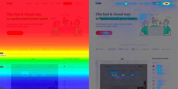
A great way to visualise what should go where on your website is to look into UX Design Heat Maps. These are coloured graphs with red being the most viewed, and blue being the least. They are used to show the elements that compete for the most attention.
This one from Hotjar’s article on Using heat maps to improve your websites UX shows two different types. On the left we have a heat map that shows above the fold being the hottest viewed section of a web page. The right shows where the users eyes are drawn to.
3. Visual Prominence
Visual prominence explains how different formats, i.e. video and image have a higher impact on a user than other elements such as text and icons, on the other hand, visual hierarchy is the placement of these elements.
This relates to the Prominence-interpretation theory which suggests that people determine a site’s credibility by judging prominent attributes of the site that grab their attention. If this interests you, you can read more about it here.
All you need to know for now is that when designing for the digital customer experience or simply looking into website features for the digital customer experience, remember that people love videos and imagery over text and icons. Try using metaphor style imagery to show what you want rather than simply explaining it in bulk text boxes.
Bringing it all together for a Great DCX Design
A seamless website to customer support to social media and beyond will create the best Digital Customer Experience for your customers and audience.
Step 1: Speak to an agency that speaks the language.
Step 2: Work with them to design you a website that:
- 1. Looks incredible.
- 2. Feels incredible.
- 3. Works incredibly.
- 4. Ranks on page 1 of Google.
- 5. Gets you an influx of leads and sales.

At Sydney Digital Marketing we have it all, we have DCX designers, SEO copy minds, strategists, QA experts and more who put our all into your website to create & execute the right marketing strategy.